

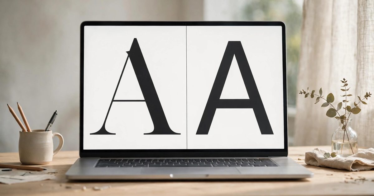
The best Squarespace fonts are the ones that read well at body size on a phone, carry a heading at 40 pixels without looking like a default, and load fast: which in practice means a short list of Google Fonts already in Squarespace’s picker. For headings, Cormorant Garamond, Playfair Display, Fraunces, Marcellus and Libre Baskerville on the serif side; Poppins, Montserrat, Jost, Space Grotesk and Sora on the sans side. For body text, Inter, DM Sans, Work Sans, Karla, Lato and Lora. The pairings below are the ones I use on client sites by business type, with the base sizes that make them work, plus the fonts that look good in the picker and fail on a live page.
What makes a font good on Squarespace specifically?
- It is a Google Font. Squarespace’s packs are Google Fonts, they load fast, and they need no upload or licence check. Adobe Fonts load an extra script.
- It has real weights. A font with only Regular gets faux-bolded by the browser, which looks smudged. Look for at least 400, 600 and 700.
- Its x-height is generous for body text, so 16 to 18 pixels stays readable on a phone. Many elegant serifs fail here and belong in headings only.
- It is not what every other site uses. Poppins and Montserrat are excellent and are also the two most common fonts on Squarespace; a pairing that swaps one of them for a near-relative (Jost for Poppins, Manrope for Montserrat) looks designed instead of defaulted.
Best Squarespace fonts and pairings by business type
| Business | Headings | Body | Why it works |
|---|---|---|---|
| Photographer, wedding, luxury | Cormorant Garamond 500 | Karla or DM Sans 400 | Editorial contrast; Cormorant needs size (48px+) and a clean sans under it |
| Therapist, wellness, coach | Fraunces or Lora 500 | Inter or Work Sans 400 | Warm serif, readable body, calm at small sizes |
| Interior designer, architect | Marcellus (all caps, tracked) | Jost 300 to 400 | Marcellus only has one weight, which suits caps headings; Jost carries the text |
| Consultant, B2B, tech | Space Grotesk or Sora 600 | Inter 400 | Modern without the startup cliches; Inter is the safest body font there is |
| Restaurant, cafe, hospitality | Playfair Display 700 | Lato 400 | Classic menu feel; Playfair at 40px+ only |
| Shop, product brand | Manrope or Plus Jakarta Sans 700 | Same family at 400 | One family, two weights, fast and consistent |
| Florist, maker, craft | Libre Baskerville 700 | Nunito 400 | Traditional serif with a soft sans |
| Law, finance, professional | EB Garamond 500 | Lato 400 | Trust without stuffiness |
| Creative studio, agency | Bricolage Grotesque or Syne 700 | DM Sans 400 | Character in headings, discipline in body |
Most of the fonts in the table are in Squarespace’s Google Fonts list; for any that are not, download the family from Google Fonts and upload it, so changing the font in Site Styles is all it takes. If the brand has its own typeface, uploading a custom font replaces the heading row and the body row usually stays a Google Font for speed.
What sizes and settings make these work?
| Setting | Value | Where |
|---|---|---|
| Base size | 17 to 18px paragraphs on desktop, never under 16px on mobile | Site Styles, Fonts, base size slider |
| Heading 1 | 48 to 64px desktop; 32 to 40px mobile | Fonts, Headings, sizes; mobile override in the CSS cheat sheet |
| Heading line height | 1.1 to 1.2 | Fonts, Headings |
| Paragraph line height | 1.6 to 1.7 | Fonts, Paragraphs |
| Letter spacing for all-caps headings | 0.05 to 0.15em | Fonts, Headings, letter spacing |
| Paragraph width | 60 to 70 characters per line | Text block width, or max-width in CSS |
| Weights loaded | Two for body (400, 700), one or two for headings | Fewer weights, faster site |
Which fonts look good in the picker and fail on the page?
- Script fonts for anything but one word. Parisienne, Great Vibes, Dancing Script: fine for a single accent word at 60px, unreadable as a heading, and a speed cost.
- Thin weights (100 to 300) for body text. Beautiful on a Retina Mac, grey mush on an average Android phone.
- Display serifs at paragraph size. Playfair, Abril Fatface and Cormorant are heading fonts; at 16px their thin strokes disappear.
- Condensed fonts for long text. Oswald and Bebas Neue work for labels and short headings, not sentences.
- Three or more families. Two is the limit that still looks intentional.
- Adobe Fonts by habit. The extra script costs every page load; use Adobe only when the brand demands a specific typeface that Google lacks.
How do you test a pairing before committing?
- Set the pairing in Site Styles and open the longest text page on the site, on a phone, outdoors. If the body text is hard, the base size or the font is wrong.
- Look at a heading over a photo, because that is where thin serifs vanish.
- Check a form and a button; the Buttons and Miscellaneous categories often still hold the old font.
- Run PageSpeed Insights before and after; a pairing that adds more than 100 to 200 ms is carrying too many weights.
Ashley Srokosz’s rundown and JPK Design Co’s pairings lean heavily on Poppins, Lato, Raleway and Lora, which are all safe; the table above is deliberately one step away from those so a site does not look like every other Squarespace site in its town. Typography is the first thing I set on a Squarespace build, before colour, because it decides whether the design reads as professional more than any other single setting.
Frequently asked questions
Headings: Cormorant Garamond, Playfair Display, Fraunces, Marcellus, Libre Baskerville, Poppins, Montserrat, Jost, Space Grotesk, Sora. Body: Inter, DM Sans, Work Sans, Karla, Lato, Lora, Nunito. All are Google Fonts in Squarespace’s picker and load fast.
Cormorant Garamond with Karla for photographers and luxury brands; Fraunces with Inter for wellness; Marcellus with Jost for interiors; Space Grotesk with Inter for consultants; Playfair Display with Lato for hospitality; Manrope at two weights for shops.
17 to 18px for paragraphs on desktop and at least 16px on mobile, headings 48 to 64px on desktop and 32 to 40px on mobile, paragraph line height around 1.6.
Script fonts for anything longer than a word, thin 100 to 300 weights for body text, display serifs at paragraph size, condensed fonts for sentences, and more than two families on one site.
The built-in font packs are Google Fonts, free for any use. Adobe Fonts offered in the picker are included with Squarespace. Fonts you upload yourself need their own web licence.
Yes. Each family and weight is a download, and Adobe Fonts add a script. Two families with two or three weights total keeps the cost negligible; five families with every weight adds noticeable load time.