

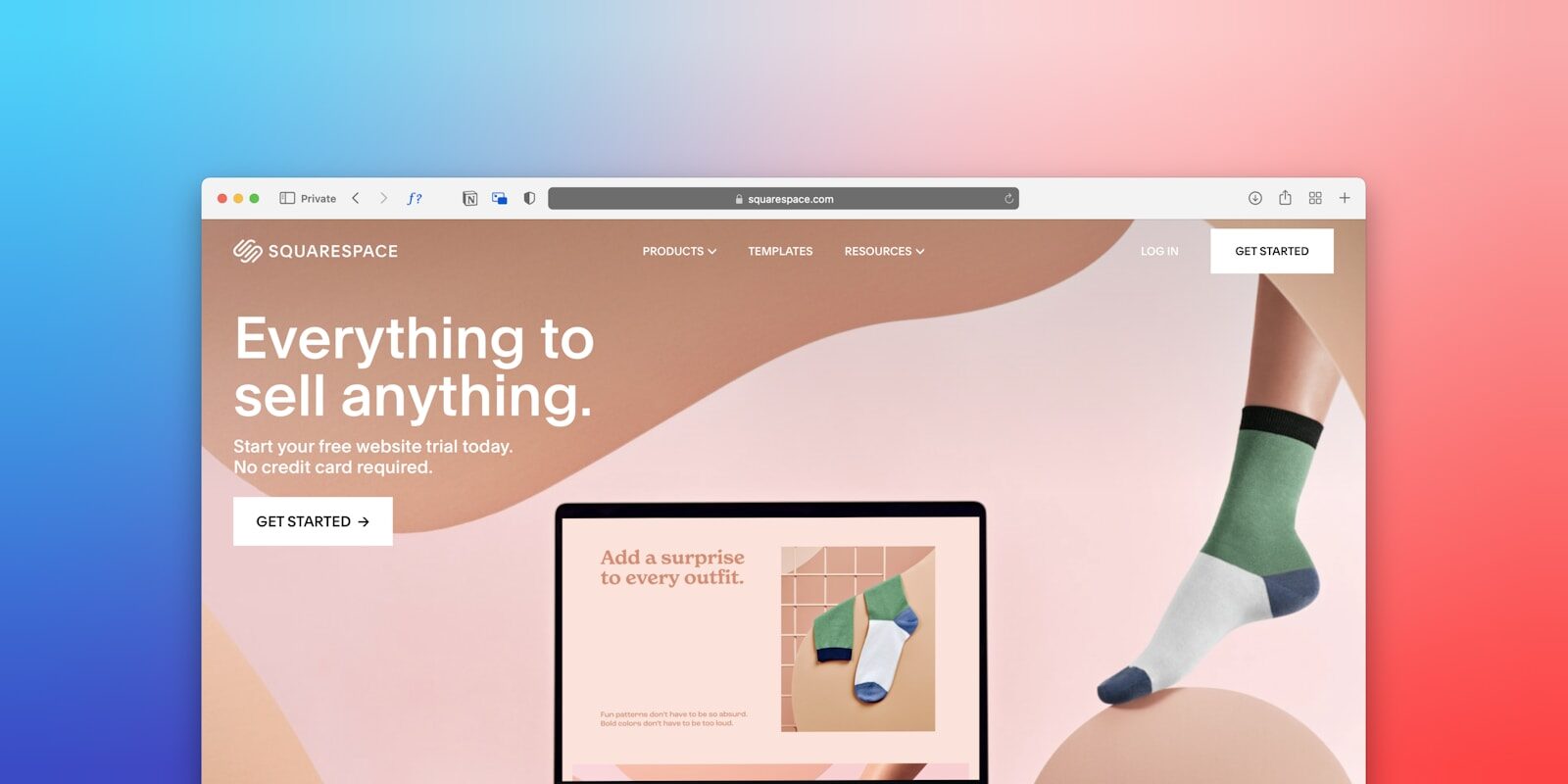
12 Squarespace Website Design Tips and Tricks That Work
Most Squarespace websites look almost identical – and honestly, that’s not a coincidence. People pick a template, drop in their photos, swap a few lines of text, and assume the job is done. The result is a site that looks like it was built in 30 minutes. Because it usually was.
The most impactful Squarespace design tips are: use a single font pairing, keep your color palette to 3 colors max, add custom CSS for spacing tweaks, and optimize every image before uploading. Small refinements compound into a significantly more professional-looking site.
Here’s the thing: Squarespace is a genuinely capable website builder when you know how to use it. But most people scratch the surface and stop there. These Squarespace website design tips and tricks are for anyone who wants to push past the defaults and build a site that earns trust, reflects their brand, and actually shows up in search results.
Whether you’re a photographer, a coach, a consultant, or a small business owner figuring it out on your own – or you’re considering hiring a web designer to handle it properly – what follows is a practical breakdown of exactly what separates a forgettable Squarespace site from a polished one.
Stop Treating Your Template Like a Finished Product
Think of a Squarespace template the same way you’d think of a furnished apartment: it’s a starting point, not a permanent setup. The furniture comes with the place – but that doesn’t mean you keep it exactly as-is.
A lot of people pick a template and feel locked into it. Same column structure, same section sizes, similar color palette. The template was only ever meant to give you a layout framework to work from. What you do with it is entirely up to you.
Here’s what actually makes the difference: go to Design > Site Styles before you touch a single page. This is where you control your global fonts, colors, button styles, and spacing – changes that ripple across every page at once. Get this right first, and the whole site shifts immediately.
Squarespace 7.1 vs. 7.0: It Matters
If you’re still on Squarespace 7.0, know that 7.1 gives you significantly more design flexibility. Global styles are more consistent, sections work more predictably, and you’re less boxed in by template-specific restrictions. If you started your site several years ago and never upgraded, that version gap may be holding your design back more than anything else.
White Space Is the Most Underused Design Tool on Squarespace
White space – sometimes called negative space – is the breathing room between elements. Between your heading and your paragraph. Between sections of the page. Around your images.
When people design their own Squarespace sites, the instinct is to fill every inch. More content feels like more value. But that’s not how design works. Cramming things together doesn’t say “I have a lot to offer” – it says “I don’t know where to look.”
Generous spacing does something visual that’s hard to describe until you see it: it makes your content feel more deliberate. More expensive. More trustworthy. It’s one of those things that designers charge for, and it costs you nothing on Squarespace to implement.
Use the section padding controls. Increase the spacing above and below your text-heavy sections. Give images room to breathe instead of stretching everything edge-to-edge. And pay extra attention to how sections look on mobile – what feels open on desktop can feel claustrophobic on a phone once the layout adjusts.
Typography Is Doing More Work Than You Think
Most people pick fonts they like and move on. That’s understandable – but typography on a Squarespace website does more than aesthetic work. It directly affects readability. Readability affects how long visitors stay on your page. And dwell time has a measurable impact on your SEO.
Let me be honest: if your body text is too small or your headings don’t create a clear visual hierarchy, visitors will skim right past your content and bounce. Not because the content is bad – because it’s hard to read.
A few principles that hold up across every Squarespace design project:
- Stick to two fonts maximum – one for headings, one for body text
- Keep body font size at 16px minimum (18px is better for most screens)
- Set line height between 1.5 and 1.7 for body copy so paragraphs feel breathable
Personally, I think most Squarespace users size their body text too small. It reads okay on a large desktop monitor, but it becomes a real strain on mobile – which is where the majority of your visitors are coming from.
Squarespace connects directly with Google Fonts through Settings > Custom Fonts if you want to go beyond the built-in options. It’s worth spending 20 minutes on this. The right font combination does more for your brand perception than a new hero image.
Mobile First, Always – Not Mobile After
Google uses mobile-first indexing. That means your Squarespace site’s mobile experience is what’s being evaluated for search rankings – not the desktop version you spent most of your time designing.
And yet, mobile is almost always treated as an afterthought. I’ve audited Squarespace sites where the desktop version looked genuinely polished and the mobile version had overlapping text, stretched images, and navigation that barely worked.
The fix is a habit, not a technical skill. While you’re designing each page, switch to the mobile preview mode regularly. Don’t wait until the site is “done.” Catch issues section by section as you build – it’s much faster than fixing everything at the end.
Common Mobile Problems on Squarespace
Image cropping: Squarespace auto-crops images differently on mobile. If your key visual content is near the edges – faces, product details, text overlaid on photos – it can get cut off. Leave breathing room in your images and check every one in mobile view.
Stacked columns: A two-column layout collapses to a single column on mobile. Make sure each text block reads coherently on its own, without the visual support of sitting next to a matching image.
Button tap targets: Thin, link-style buttons are easy to click with a mouse. They’re frustrating on a phone. Test your buttons on an actual device – not just the preview tool – before you launch.
The Squarespace SEO Settings Most People Leave Empty
Your site can look stunning and still never be found. Design and discoverability are two completely separate problems, and most Squarespace sites solve the first one while completely ignoring the second.
These Squarespace website design tips and tricks only matter if people can actually reach your site. So here’s a fast SEO audit you can run yourself right now.
Page titles and meta descriptions: Go into each page’s individual settings and write a unique SEO title (under 60 characters) and meta description (under 160 characters). Squarespace doesn’t write these for you, and leaving them blank means Google writes them instead – usually pulling random text from the page that isn’t particularly compelling.
Image alt text: Click each image in the editor and add a real, descriptive caption. Not “photo1.jpg” – something like “brand photographer in Chicago with camera.” This helps with image search, helps screen readers, and helps Google understand your page context.
URL slugs: Squarespace sometimes generates messy slugs when you duplicate pages or import content. Clean them up manually. `/services` is better than `/services-copy-3`. Small thing, real impact.
Site title and tagline: Found under Settings > General. This appears in browser tabs and in certain search result formats. Keep it clear, accurate, and relevant to what you actually do.
For a deeper look at getting a new site ranking from scratch, this guide on SEO for new websites walks through the full strategy – the Squarespace-specific steps are just one part of a bigger picture.
Custom CSS: A Little Goes a Long Way
Squarespace isn’t strictly no-code. You can add custom CSS through Design > Custom CSS, and it opens up meaningful design control without requiring you to build anything from scratch.
Used strategically, custom CSS is useful for changing hover effects on buttons or navigation links, hiding specific elements on mobile versus desktop, adjusting font sizing on an individual section without touching your global styles, and adding subtle entrance animations to headings or images on scroll.
The Squarespace official help center documents a lot of this well, and there’s a large community of designers who share CSS snippets for specific versions and use cases.
One thing to keep in mind: if Squarespace releases a structural update to a template, custom CSS can occasionally break. It’s not a common problem, but it’s worth documenting what you’ve added so you know what to fix if something looks off after an update. I usually leave a short comment in the CSS itself for exactly this reason.
Pre-Launch Squarespace Checklist
Before you hit publish, work through this list:
This list catches the majority of issues I find when auditing Squarespace sites before launch. If you’re working with a designer on other platforms – WordPress, Showit, or Wix – the checklist categories are similar, but the dashboard locations are different. Either way, a pre-launch audit saves a lot of post-launch embarrassment.
If you ever outgrow what Squarespace can do, learn what makes WordPress a strong alternative for growing businesses and whether a platform migration makes sense for your situation.
Conclusion
Squarespace makes it easy to build a website. It doesn’t automatically make it easy to build a good one. The gap between a generic Squarespace site and a polished, professional one almost always comes down to the same details: intentional spacing, clean typography, mobile readiness, and SEO settings that are actually filled in.
These Squarespace website design tips and tricks give you a clear path forward. Work through them one section at a time and you’ll see a real difference in how your site looks, reads, and performs.
If you’d rather hand it off to someone who handles this every day, Adil Makhdoom is available to help – whether that’s a full Squarespace design build, a design audit of your existing site, or a migration to WordPress or Showit if you’re ready for something more. Reach out and let’s build something you’re actually proud to share.
FAQ
Q: Is Squarespace good for SEO?
A: Squarespace has solid built-in SEO foundations – clean URLs, automatic sitemaps, SSL, and mobile-responsive templates all come standard. But the platform won’t rank your site for you. You still need to write your page titles, meta descriptions, image alt text, and create genuinely useful content. Squarespace won’t hold you back from ranking well, but it also won’t do the work. That part depends on your content and strategy.
Q: Can I use custom fonts on a Squarespace website?
A: Yes. Squarespace lets you upload custom fonts through Settings > Custom Fonts, and it integrates directly with Google Fonts as well. You can assign different typefaces to headings, body text, buttons, and navigation independently. Most built-in Squarespace templates come with a decent font library, but if your brand uses a specific typeface, you have the flexibility to upload and apply it across the site.
Q: How do I make my Squarespace site look more professional?
A: The biggest visual improvements come from consistent spacing, a limited color palette (two or three brand colors at most), high-quality photos, and clean typography with a clear size hierarchy. Avoid using every color and font option available to you – restraint is what makes a site look designed rather than decorated. Getting your global styles right in Design > Site Styles makes the biggest difference with the least per-page effort.
Q: What’s the difference between Squarespace 7.0 and 7.1?
A: Squarespace 7.1 is the newer version and offers more design flexibility – global styles apply consistently across all pages, there are more layout options, and you’re not locked into template-specific styling restrictions the way you are in 7.0. If you’re starting a new Squarespace site today, you’ll be on 7.1 by default. If you have an older 7.0